ux/ui
Redesigning SIRT’s Digital Identity
Industry
Film, television & interactive media
Client
SIRT Centre
Timeframe
Summer 2025
Role
Content & interaction designer intern
A three-month internship project focused on reimagining SIRT’s online presence
through accessibility, clarity, and storytelling.
through accessibility, clarity, and storytelling.
overview
During my summer internship at the Screen Industries Research and Training Centre (SIRT), I worked as a Content & Interaction Designer, focusing on redesigning the organization’s website and conducting AI tool research to support creative and technical workflows. As the sole designer, I managed everything from UX research and visual design to stakeholder communication and implementation guidance.
My goal was to transform SIRT’s digital presence into one that reflects its innovative, forward-thinking mission, bridging research, technology, and creative practice.
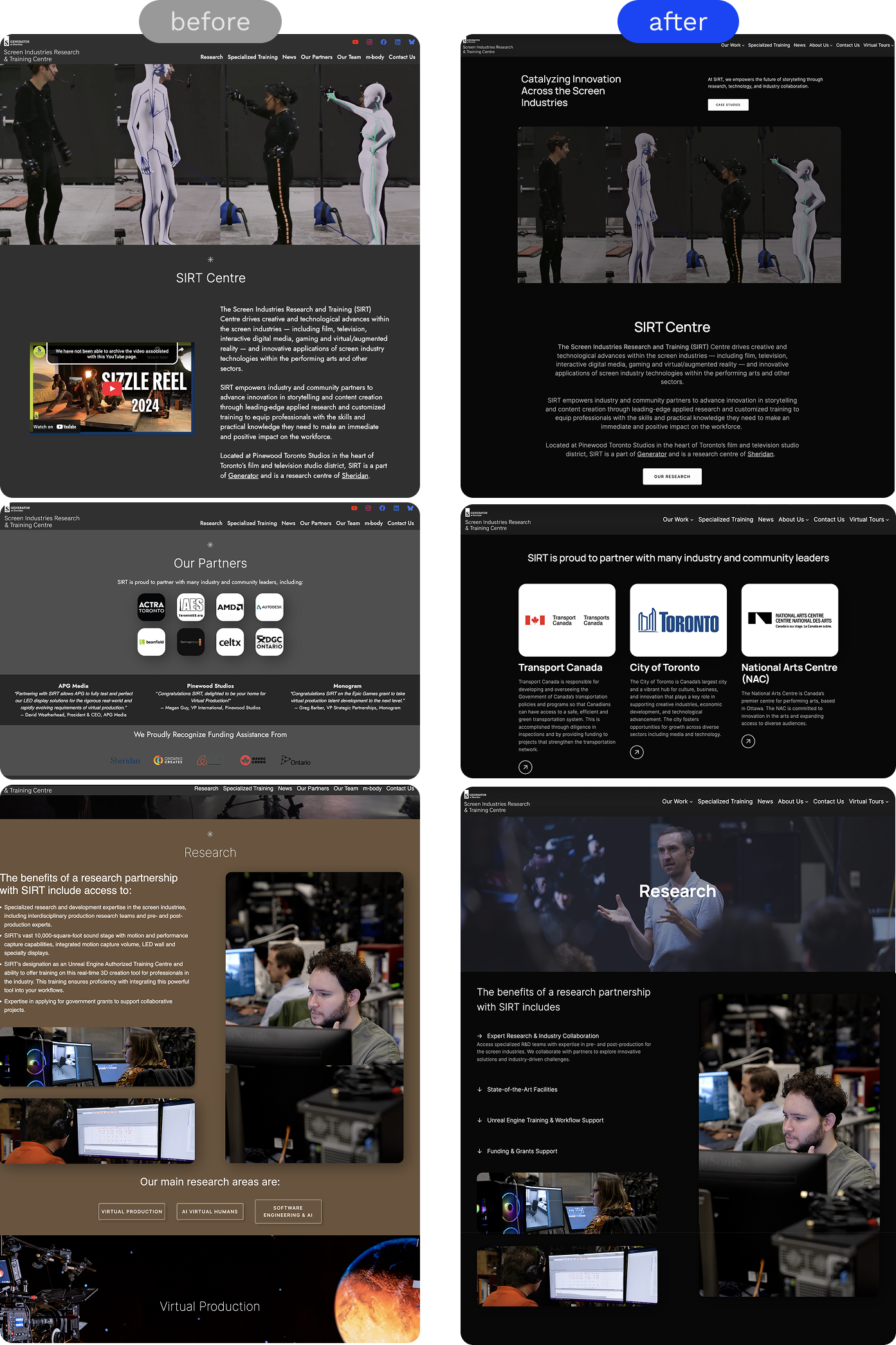
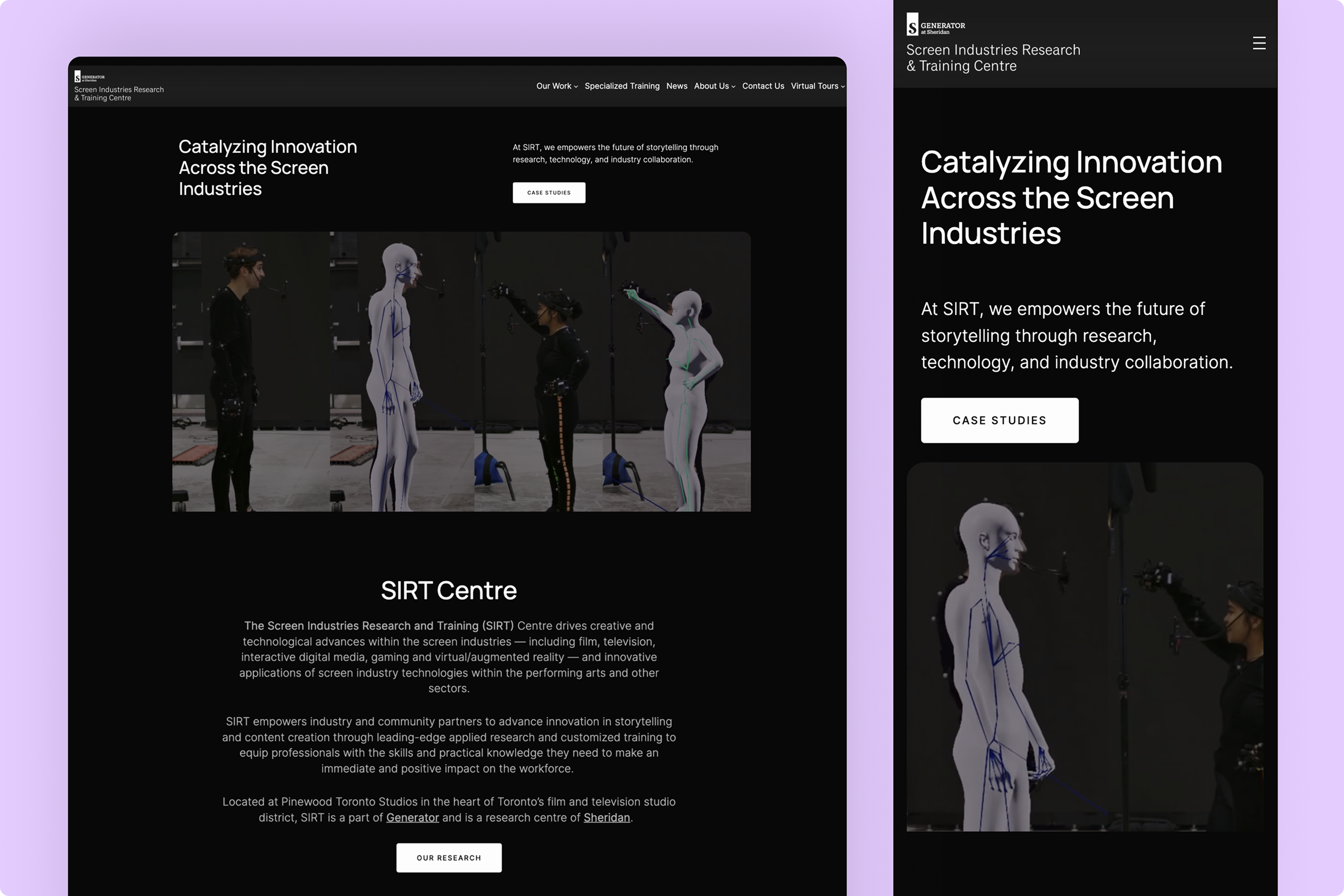
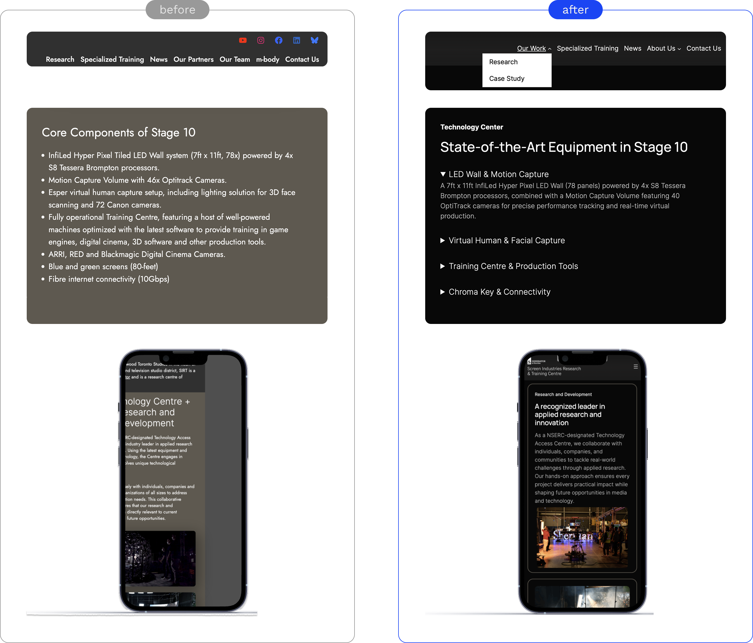
Before vs. after comparison of SIRT website
problem and opportunity
SIRT’s existing website no longer matched its evolving brand. While its projects explored cutting-edge technologies, the website failed to communicate the same level of innovation.
Key issues:
1. Lack of responsiveness across different screen sizes, resulting in an inconsistent browsing experience.
2. Outdated visual design with inconsistent typography that weakened brand cohesion
3. Accessibility concerns by cluttered text layouts and excessive background color variations.
4. Confusing navigation with with overlapping content and a poorly defined information hierarchy.
To address this, I worked closely with the marketing team to align design decisions with business goals and brand strategy, applying a user-centered redesign approach that ensured the site was not only modern but also functional and accessible.
How might we redesign SIRT’s website to reflect the organization’s innovation and leadership in the screen industry, while ensuring accessibility, clarity, and usability for diverse audiences from researchers to industry partners?
my approach
I began by conducting a comprehensive website audit using Nielsen’s Usability Heuristics, alongside a competitive analysis of other screen-industry studio to understand how they structured navigation, presented information, and told their brand stories.
Using the WAVE accessibility evaluation tool, I identified several usability and accessibility issues in SIRT’s existing layout - including poor hierarchy, inconsistent navigation, and weak contrast - which became the foundation for the redesign.
The redesigned website focused on three goals:
Clarity - simplified navigation and a cleaner structure for easier content discovery.
Consistency - unified typography, grid systems, and colour palette aligned with SIRT’s brand identity.
Accessibility - ensured the design met accessibility standards while maintaining visual appeal.
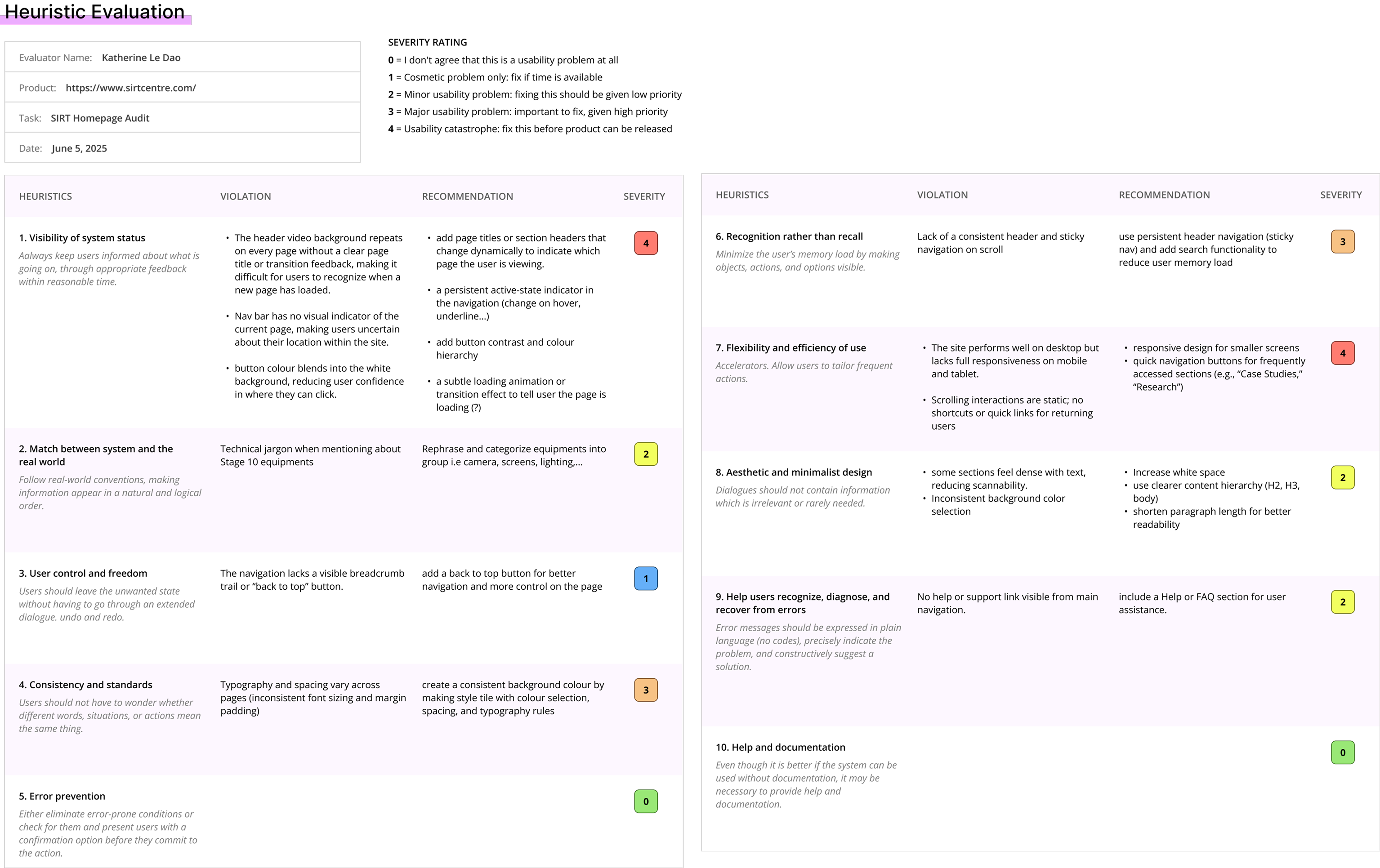
Heuristic evaluation on SIRT website
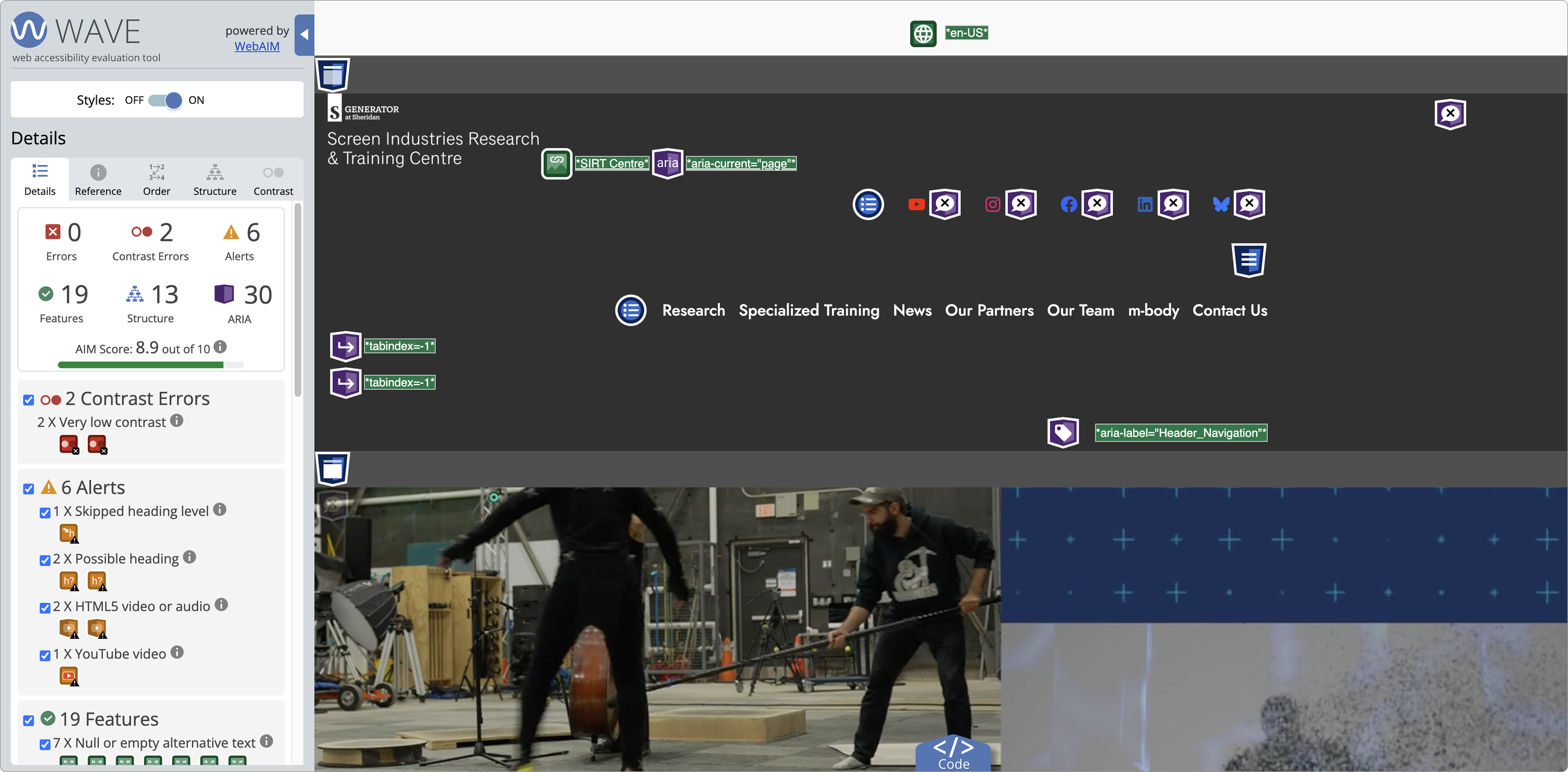
Accessibility check through WAVE
agile in action - designing independently and collaborating widely
As the only designer on the team, I adopted an Agile-inspired, self-organized workflow. This allowed me to manage my own sprints, set priorities, and adapt quickly to continuous feedback from marketing, production, and managers.
To say aligned, I:
To say aligned, I:
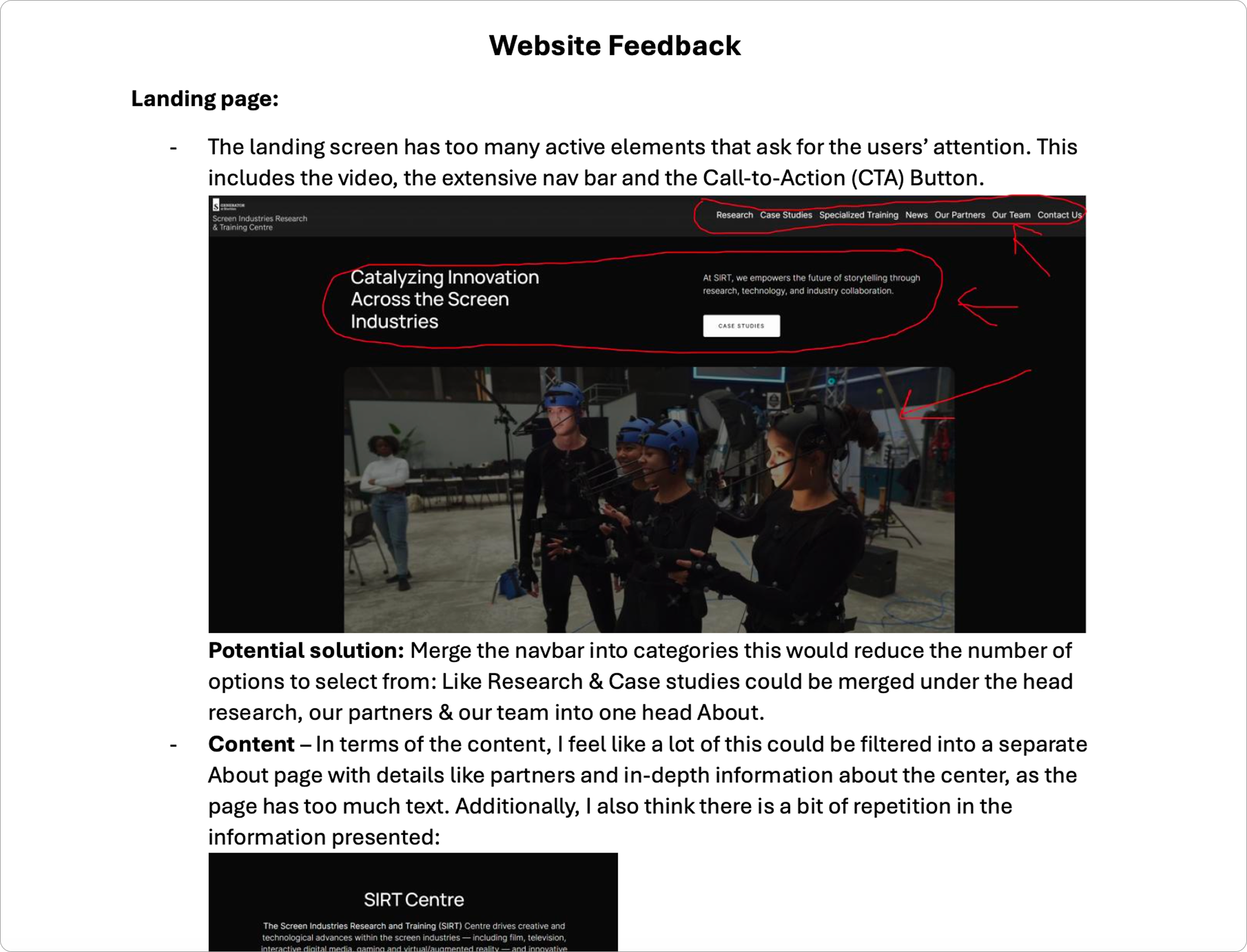
- Used Notion to collect and organize design feedback from multiple stakeholders
- Met regularly with the software engineering lead for usability discussions
- Conducted A/B tests and quick user interviews with staff and visitors
- Reviewed designs with the marketing and production specialists to ensure business goals and brand tone were represented accurately
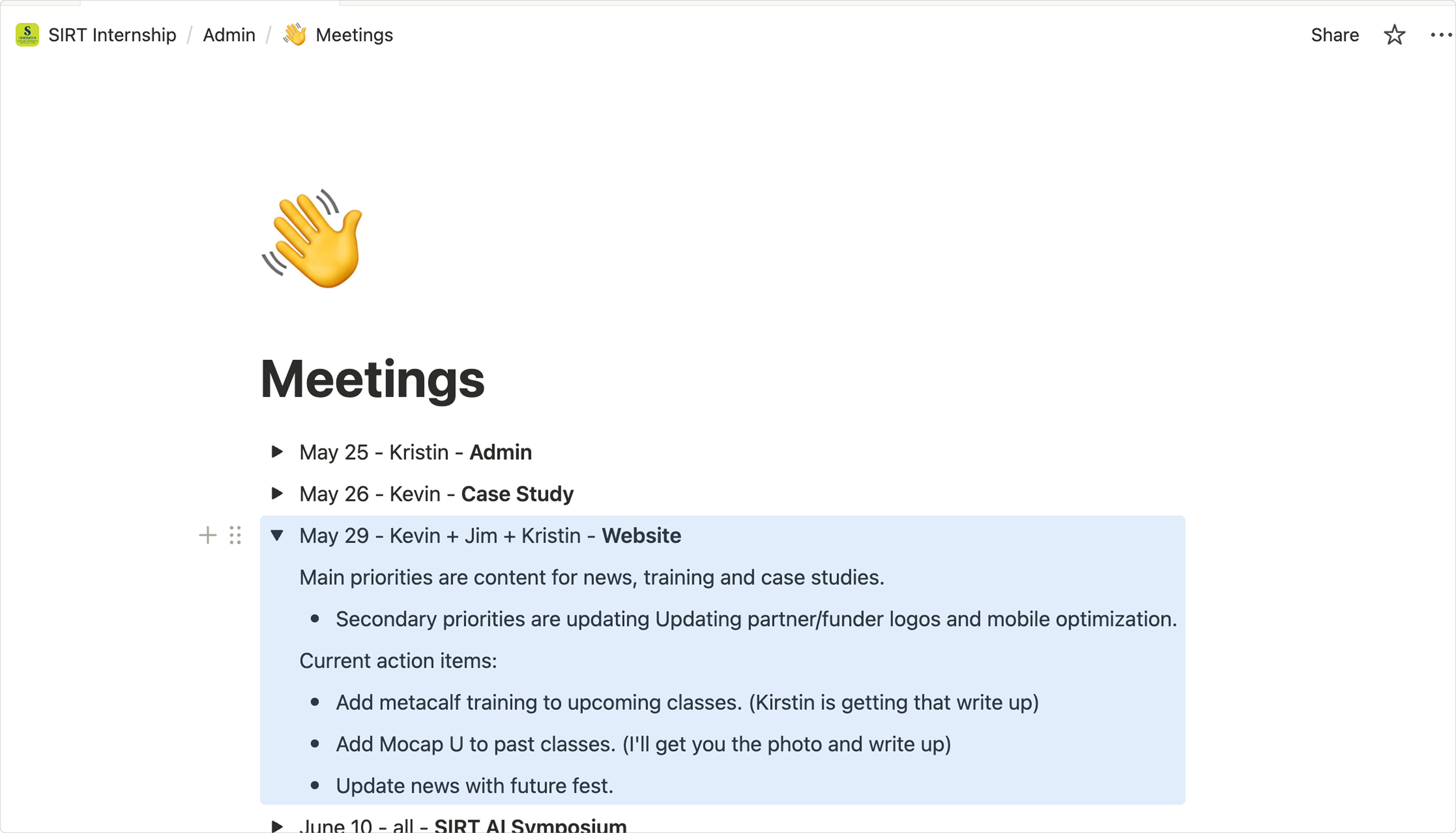
Notion notes from meetings with the marketing, development, and management teams, where we discussed feedback and progress on the website redesign.
trusting the process
With only three months to redesign the website while also writing over ten project case studies, I learned to work efficiently and make quick, informed design decisions.
I drew inspiration from modern film and technology studios, leaning toward dark-mode interfaces, minimal layouts, and clean, modern typography that captured the sophistication of SIRT’s work.
If I were to visualize the inspiration now, my moodboard would be defined by the words: modern, cinematic, technological, and minimalist.
If I were to visualize the inspiration now, my moodboard would be defined by the words: modern, cinematic, technological, and minimalist.
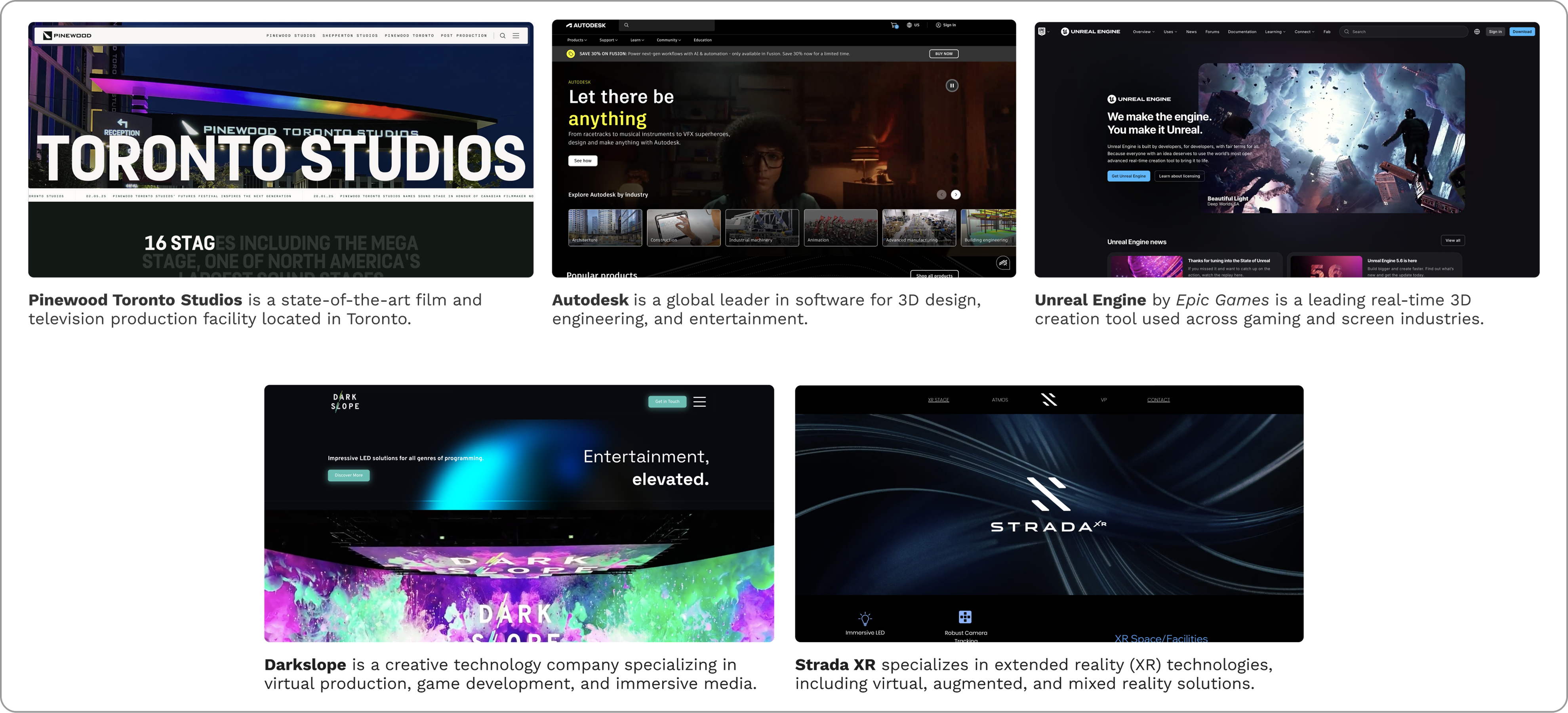
My inspirations for SIRT website
Information architecture and feedback-based iterations
Due to the short timeline, I worked directly in WordPress, gathering feedback in real time from the marketing and engineering teams then edit the website accordingly.
Each iteration involved quick adjustments rather than long review cycles. I tracked all input and changes in Notion, ensuring a transparent, evolving process that encouraged collaboration and trust.
Each iteration involved quick adjustments rather than long review cycles. I tracked all input and changes in Notion, ensuring a transparent, evolving process that encouraged collaboration and trust.
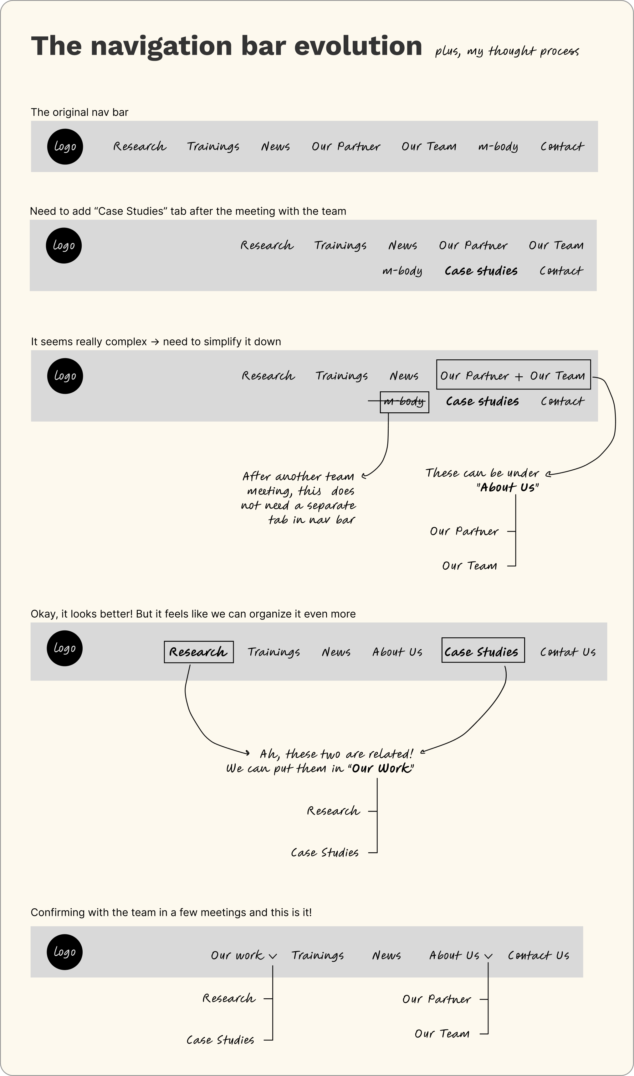
A peak into how I organized information in the navigation bar
design for accessibility
Throughout the redesign, my guiding principles were accessibility, clarity, consistency, and storytelling. Every design decision was made to ensure that visitors - from researchers to industry partners - could easily find what they needed and understand SIRT’s impact.
Specificallly, I did:
1. Improve typography hierarchy for readability.
2. Simplify navigation bar to reduce cognitive load.
3. Rebuilt the landing page to communicate SIRT’s mission clearly and highlight key research projects.
4. Ensure responsiveness across devices so that the experience remained consistent everywhere.
After implementation, I conducted user testing sessions with staff members and external visitors to gather feedback on navigation clarity and content flow.
Reaching out to an external designer for feedback during user testing provided valuable insights and helped me challenge my own design biases!
the launch day!
One of my proudest outcomes was the new landing page, which became more informative and intuitive with improved navigation flow.
The updated site provided visitors with a clear understanding of SIRT’s research, training programs, and industry collaborations, all while maintaining visual balance and accessibility.
Before deployment, the design was reviewed and approved by directors, managers, and key stakeholders, confirming its alignment with both brand and organizational goals.
Key improvements including:
Before deployment, the design was reviewed and approved by directors, managers, and key stakeholders, confirming its alignment with both brand and organizational goals.
Key improvements including:

Streamlined navigation and clearer content hierarchy
Stronger brand identity and visual cohesion
Enhanced readability and gave user the control over information they want to see
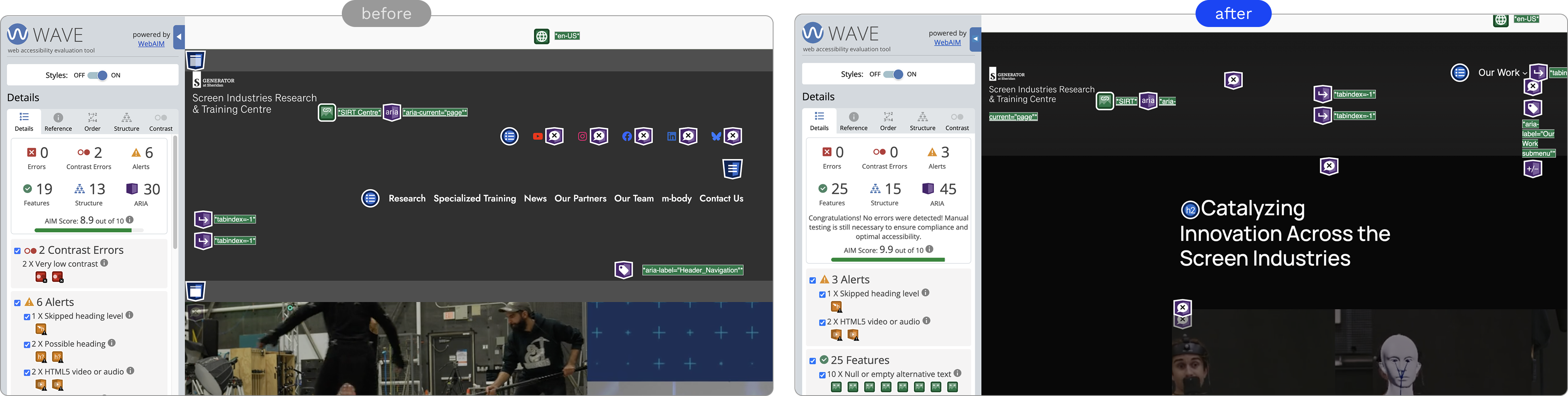
Significantly improved accessibility compliance after the redesign, WAVE test results were astonishing:
- Contrast errors were fully eliminated (↓100%)
- Alerts dropped by half (↓50%)
- ARIA attributes increased by 50%
- The WAVE score rose from 8.9 to 9.9.
The new design is fully responsive, maintaining clarity, readability, and functionality across multiple devices from large desktop screens to compact mobile displays.
Beyond designing...
Outside of the website redesign, I had the chance to explore AI tools and motion capture at SIRT.
I researched how AI is being used across the creative and screen industries, experimenting with platforms like Google NotebookLM and writing internal case study posts to help staff understand how these tools could improve workflows and spark new ideas. I also worked with the production team on motion capture projects, learning how real-world movement data connects to 3D characters and interactive digital environments.
These experiences opened my eyes to how AI and motion technology are changing the way we design and create, and they sparked my own curiosity about how interaction design can bridge creativity and emerging tech.
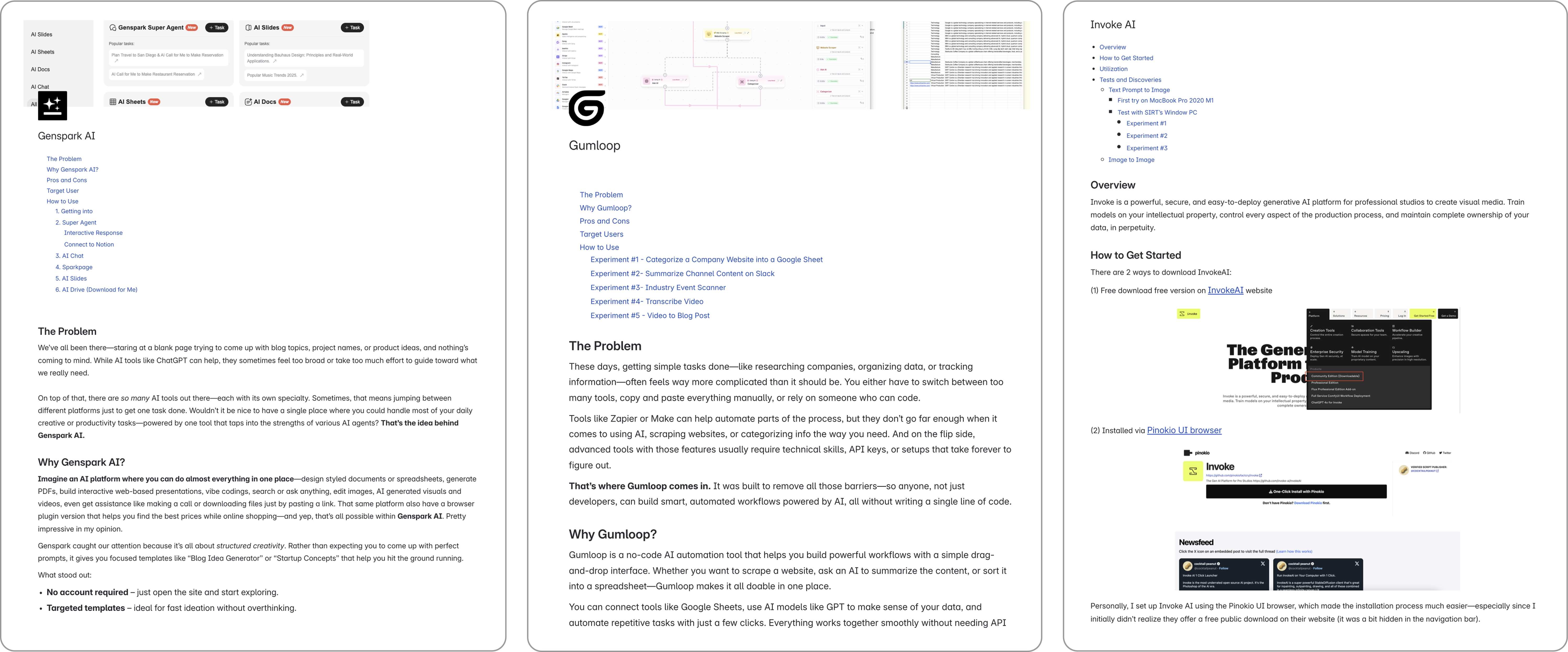
Experimenting variety AI tools and writing internal case study posts
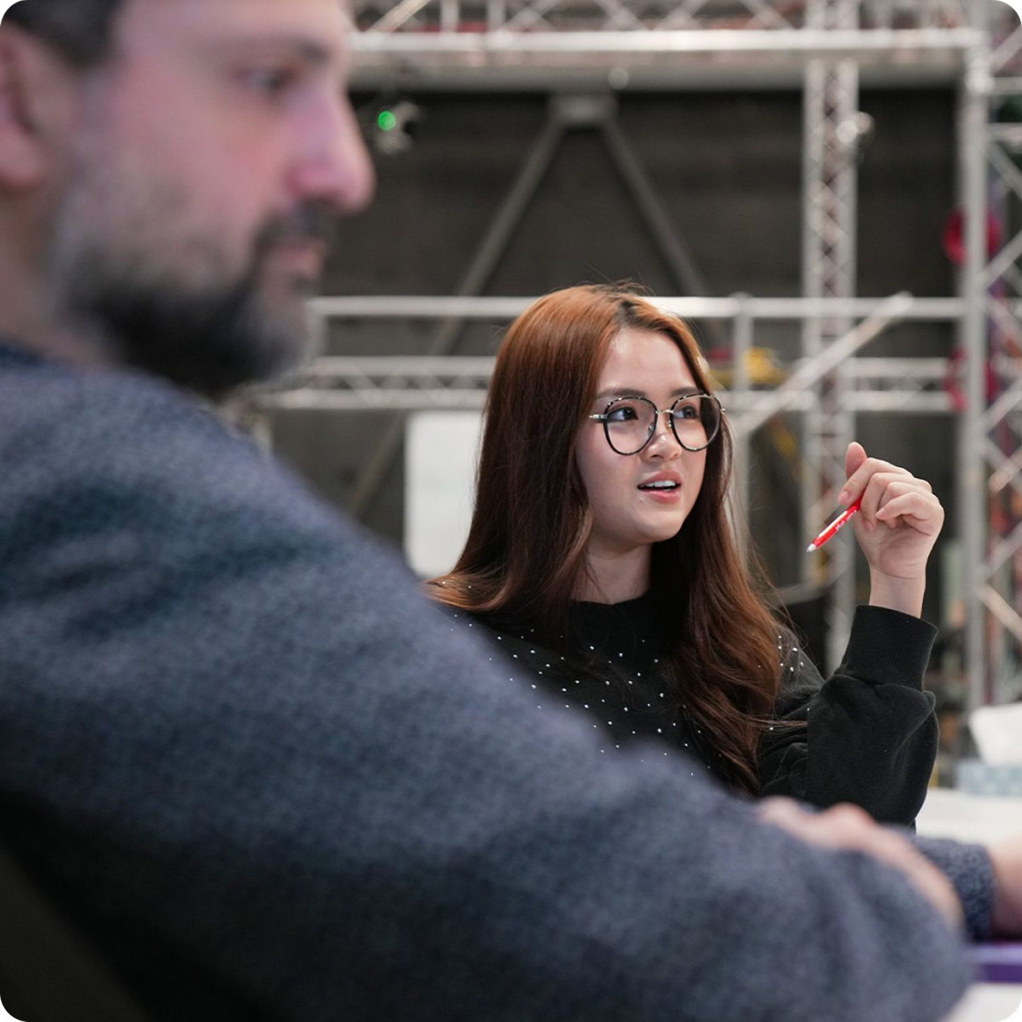
Bi-weekly team meeting
Motion capture on Autodesk Flow Studio
what did i learn?
Designing independently, collaborating effectively
Managing a full redesign alone taught me how to organize communication, structure feedback, and make confident design decisions while staying receptive to critique.
Agile mindset and adaptability
I learned to embrace flexibility, adapting to shifting priorities and integrating feedback quickly through a self-managed, iterative process.
Bridging creativity and strategy
I realized that design is not only visual problem-solving but also a bridge between user needs, business goals, and brand storytelling.
Learning from research
Exploring AI tools expanded my awareness of technology’s role in design, strengthening my curiosity and openness to innovation in future projects.