ux/ui
Building an efficient and scalable Design System for Hackville 2026
TIMELINE
2 months
TOOL
Figma
ROLE
Product design lead
TEAM
Emily Ibanez
Parris Tinianov
Parris Tinianov
TL;DR
PROBLEM
The previous Hackville's design system couldn't scale to support a new custom-built platform or the collaboration between designers and developers.
USERS
Designers and developers in the Hackville team
IMPACT
Delivered a scalable design system, brand identity, and a live website that navigating 370+ hacker applications
This case study focuses on how I co-led the creation of Hackville 2026 ’s design system to support both design scalability and developer collaboration.
overview
Hackville is Canada’s first college-run hackathon, organized by Sheridan students.
This year marked a turning point, our dev team grew stronger, giving us the opportunity to build everything from scratch rather than relying on Webflow templates.
As a new Hackville’s Design Lead for the 2025-2026 season, I co-led the creation of a new design system and website to support a more robust hackathon experience.
Our goal was clear:
As a new Hackville’s Design Lead for the 2025-2026 season, I co-led the creation of a new design system and website to support a more robust hackathon experience.
Our goal was clear:
Design a scalable, accessible system that could unify design and development while meeting our October 31st launch deadline.
problem and opportunity
Hackville’s previous design system was functional but not scalable or developer-friendly. It was built for a smaller team and didn’t support new features like participant dashboards or custom registration systems.
As we transitioned to a full development workflow, we asked ourselves:
As we transitioned to a full development workflow, we asked ourselves:
How might we build an accessible and developer-friendly design system that allows Hackville’s growing team to launch a new participant platform efficiently and consistently by October 2025?
This meant building a structure that balanced aesthetics, accessibility, and implementation speed - a system equally useful for designers and developers.
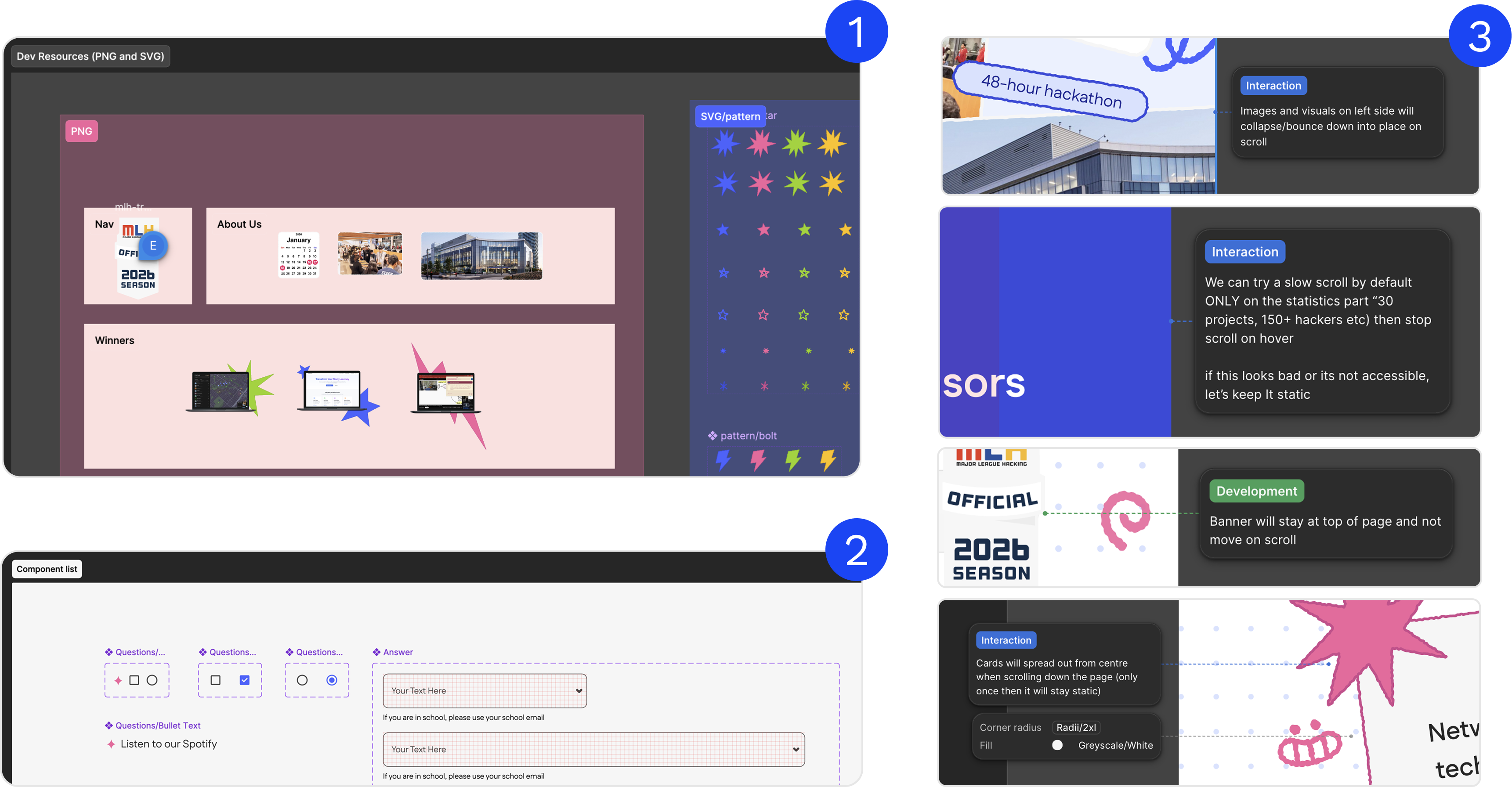
2025 - The previous designer handoff only included basic spacing notes, lacking image assets and interaction details.
2026 - The current designer handoff documentation is more comprehensive, including spacing guidelines, image assets in both PNG and SVG formats, and detailed interaction annotations.
2026 - The current designer handoff documentation is more comprehensive, including spacing guidelines, image assets in both PNG and SVG formats, and detailed interaction annotations.
what did i work on?
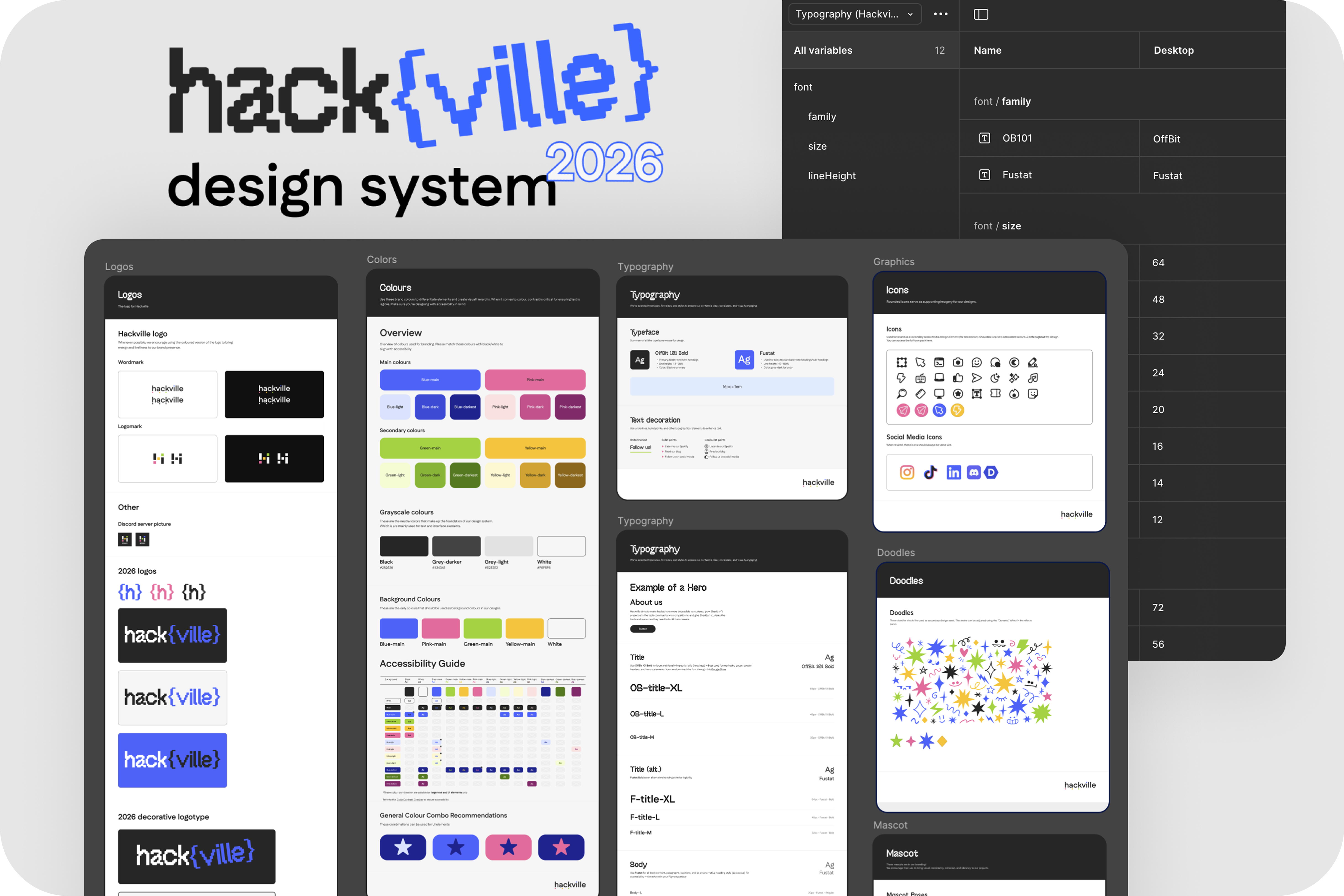
I worked alongside Emily (the other design lead) and Parris (social media lead) to build the entire system from the ground up icluding defining tokens, styles, and components that would form the foundation of Hackville’s visual identity.
My responsibilities included:
1. Collaborating with social media lead to develop moodboards reflecting our new brand direction.
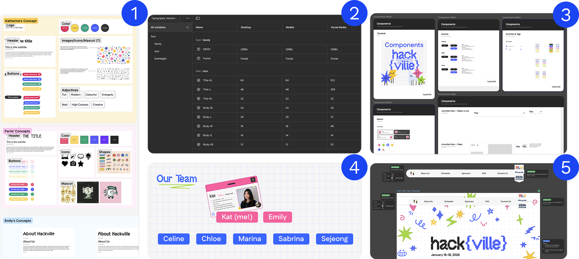
2. Creating design tokens/variables for typography and spacing.
3. Building a component library in Figma using variables and auto layout.
4. Managing a team of product designers, ensuring consistent progress and communication.
5. Preparing developer handoff documentation and aligning design with code feasibility.
My responsibilities included:
1. Collaborating with social media lead to develop moodboards reflecting our new brand direction.
2. Creating design tokens/variables for typography and spacing.
3. Building a component library in Figma using variables and auto layout.
4. Managing a team of product designers, ensuring consistent progress and communication.
5. Preparing developer handoff documentation and aligning design with code feasibility.
my approach
We began with competitive analysis including studying how other hackathons like Hack the North, Hack the 6ix, and UofTHacks approached their systems.
Accessibility guided every decision, from high-contrast color palettes to readable typography and responsive layouts.
Our brand tone drew inspiration from Adobe’s 2025 Design Trends, embracing bold minimalism, handcrafted elements, geometric shapes, and playful pixel motifs.
Accessibility guided every decision, from high-contrast color palettes to readable typography and responsive layouts.
Our brand tone drew inspiration from Adobe’s 2025 Design Trends, embracing bold minimalism, handcrafted elements, geometric shapes, and playful pixel motifs.
We wanted Hackville 2025 to feel youthful, energetic, and distinctly Gen Z. It is truly a space where creativity and technology meet optimism.
Moodboard
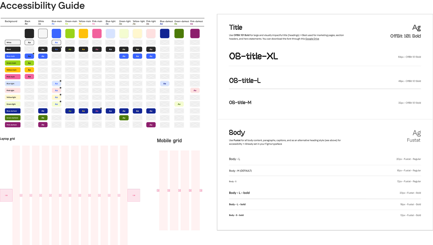
Accessibility check on colours, typography and layout
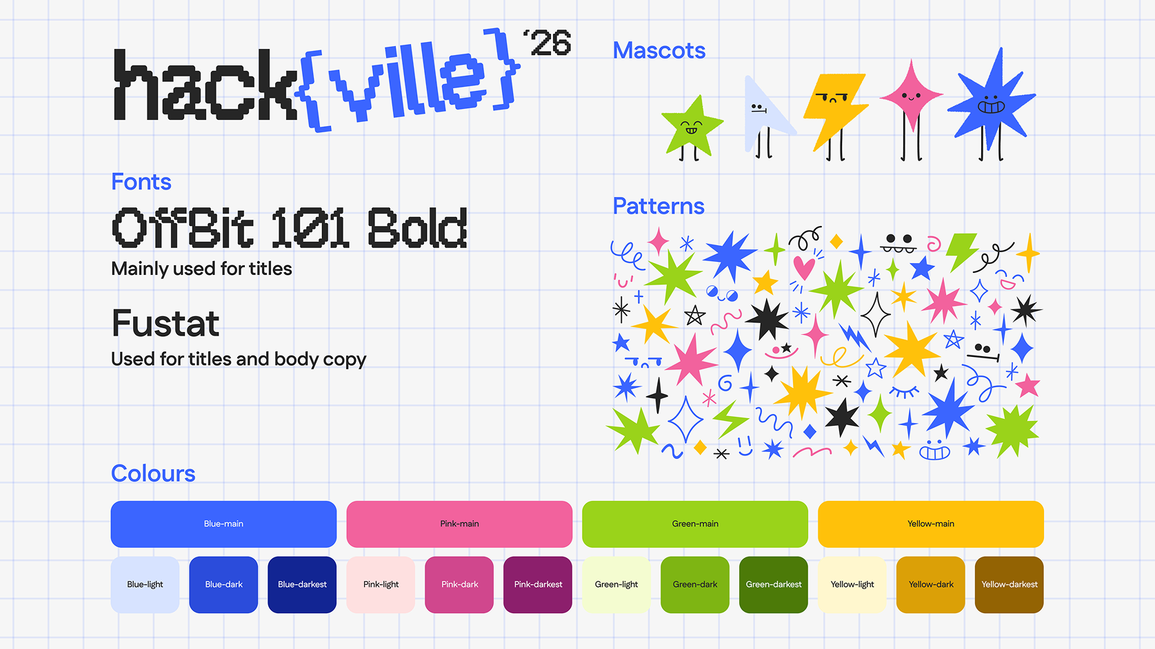
Hackville'26 style tile
learning atomic design - the basic of design system
I really wish I was born with the ability to create design systems. When I first started, I had no idea how to organize or name my components, let alone create a full system. Weeks of self-learning (and continuing), I came across a Figma YouTube video introducing the concept of Atomic Design, and it completely changed the way I work.
Understanding how designs can be broken down into atoms, molecules, and organisms helped me see structure in creativity. I began viewing every design decision through a systematic lens, and applied this mindset to Hackville’s design system. Now, every component I build follows clear logic: organized with Auto Layout, reusable components, and consistent visual tokens. You won’t find a single frame in my file without them.
Understanding how designs can be broken down into atoms, molecules, and organisms helped me see structure in creativity. I began viewing every design decision through a systematic lens, and applied this mindset to Hackville’s design system. Now, every component I build follows clear logic: organized with Auto Layout, reusable components, and consistent visual tokens. You won’t find a single frame in my file without them.
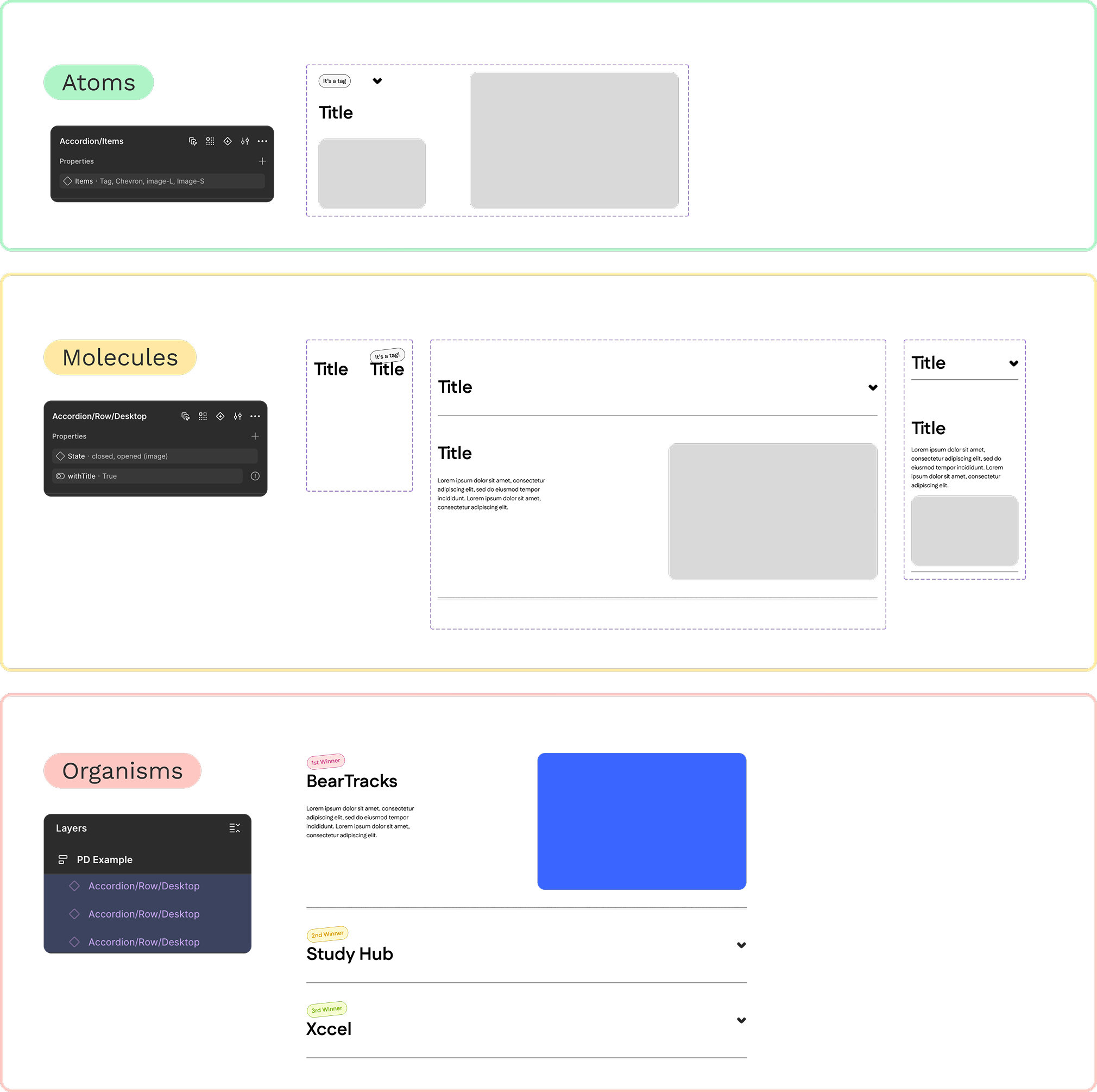
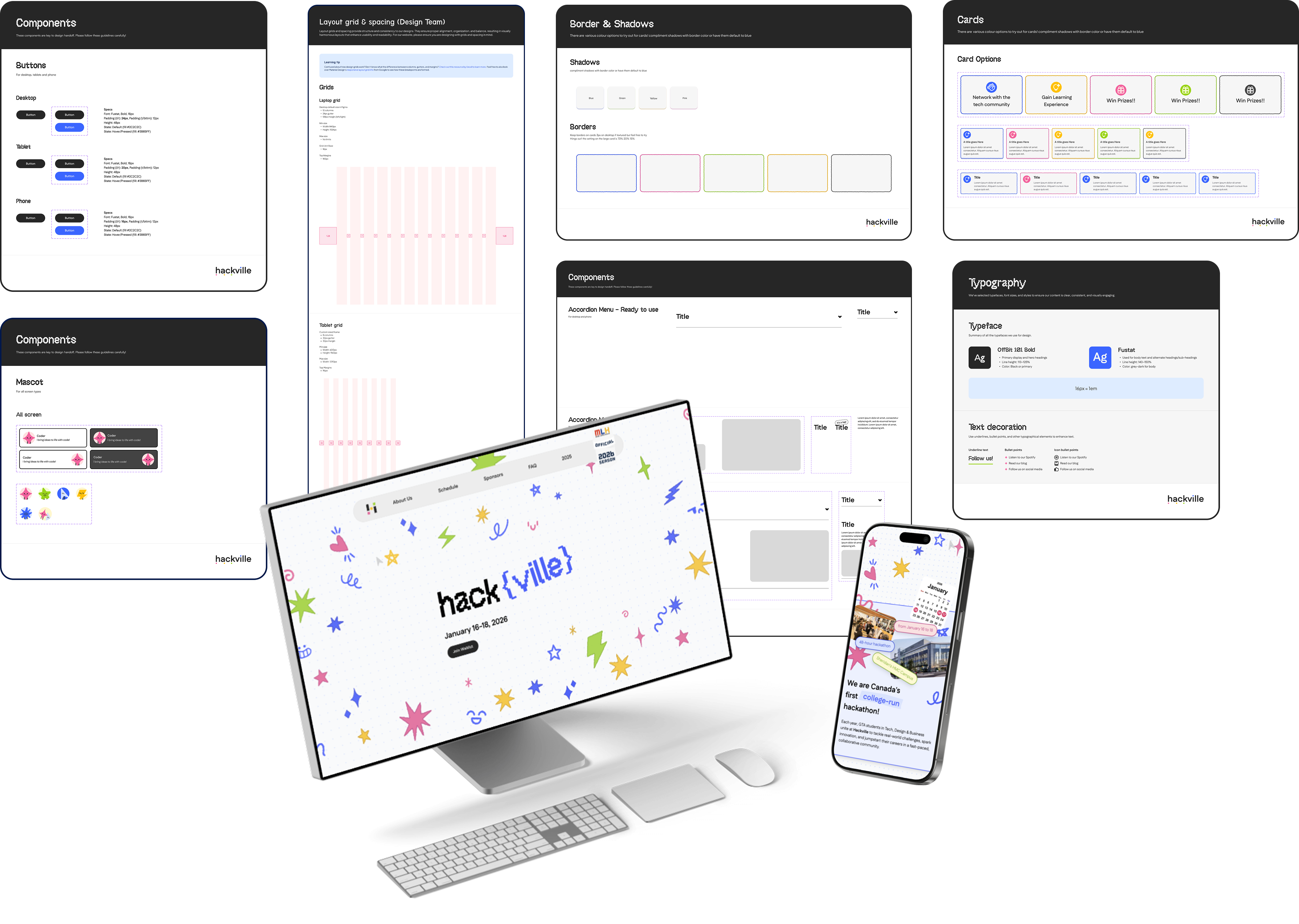
How I created component by applying atomic design framework
component architecture - keeping it simple yet scalable
With both my design team and development team in mind, I knew the system had to be simple, practical, and easy to adopt. I need to build a foundation that both designers and developers could trust and expand on.
What kept our system scalable was following Atomic Design principles, using nested components, and leveraging component properties to simplify variants. This approach made the system flexible enough for quick updates, yet structured enough to maintain consistency across every screen.
What kept our system scalable was following Atomic Design principles, using nested components, and leveraging component properties to simplify variants. This approach made the system flexible enough for quick updates, yet structured enough to maintain consistency across every screen.
Button component
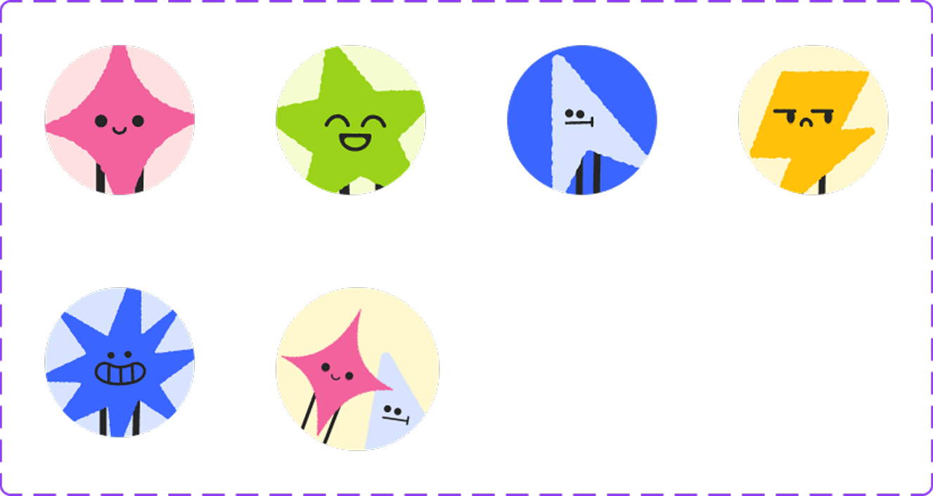
Mascot component
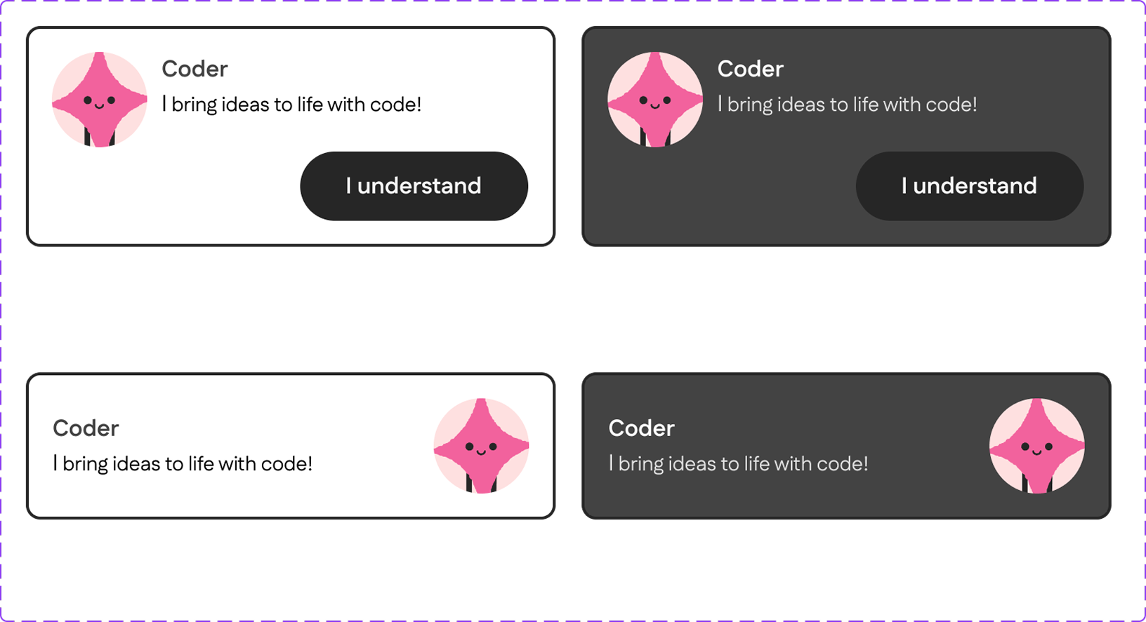
A set of nested components with different variants (dark/light mode, with/without button)
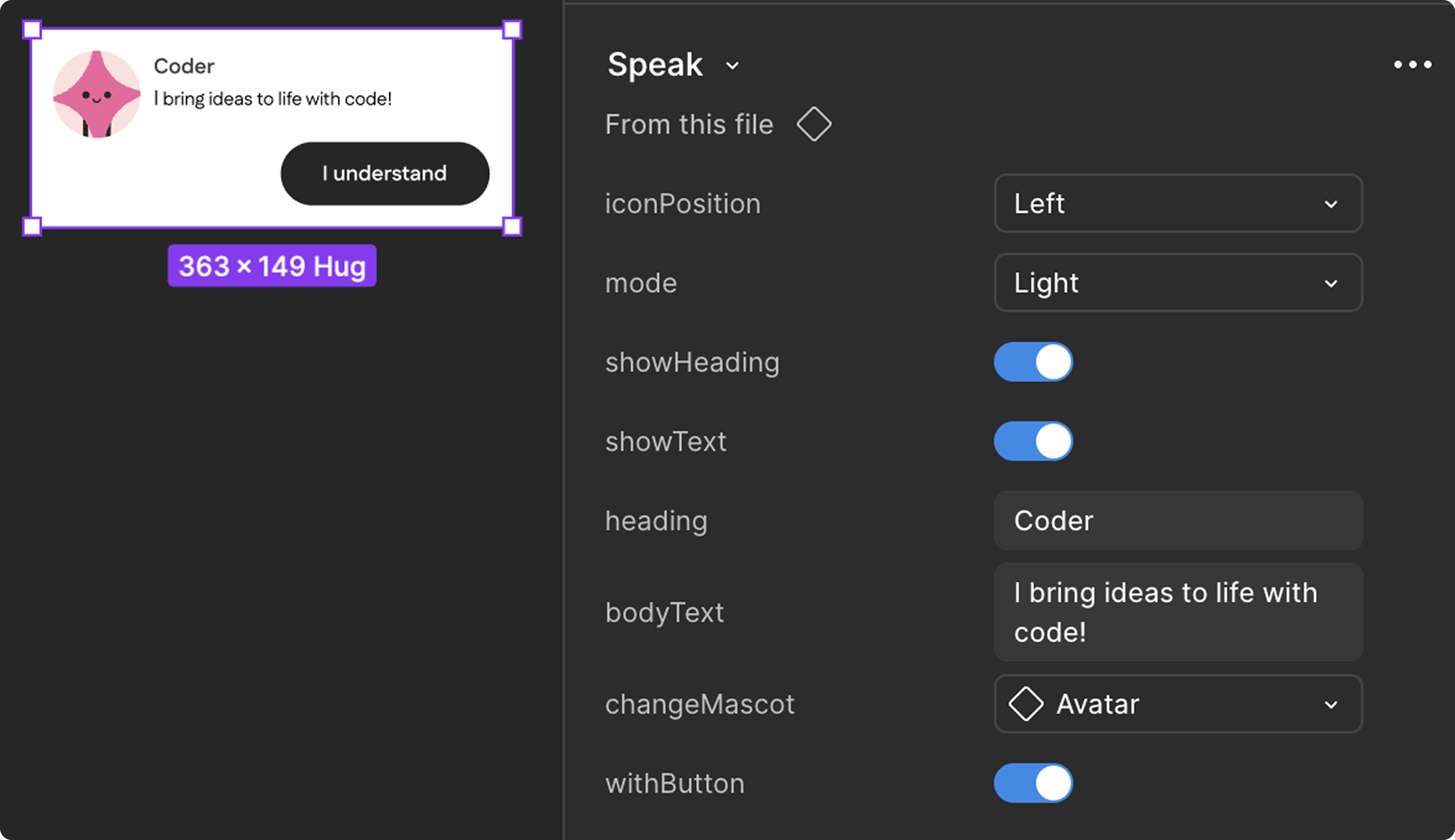
How I set up a nested component
iterations and learning to let go
At first, we built our foundation using Chakra UI as a reference. It seemed like the perfect starting point for a scalable system, but soon we realized it was too complex for our needs.
After weeks of refining, we made the hard decision to scrap the original version and rebuild from scratch. Letting go wasn’t easy, but it was liberating. That reset helped us focus on what truly mattered: clarity, usability, and developer adoption.
The new system was simpler, faster, and better aligned with our project scope.
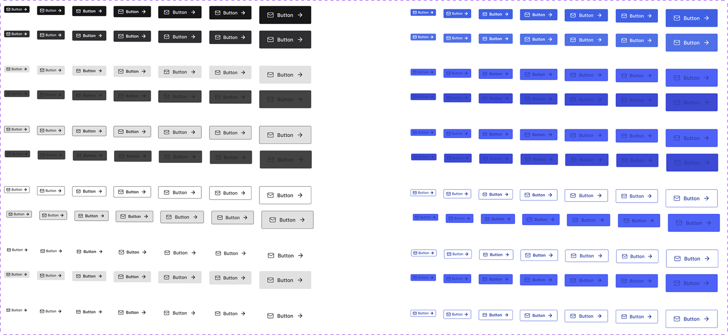
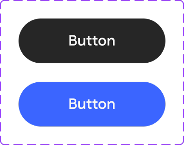
Original button component inspired from Chakra UI
Our final button component
dev communication and handoff documents
We maintained bi-weekly syncs with developers and presidents to align design with technical feasibility.
Weekly design reviews kept the product team connected and accountable. Most of our collaboration happened on Discord, where we discussed progress, exchanged feedback, and refined ideas in real time.
Early on, there was miscommunication during the handoff process as developers did not fully understand some of our design intentions. To fix this, I restructured and organized our documentation into clear sections:
1. Developer resources - image exports, icon sets, and animation notes.
2. Component references - button states, form patterns, modals.
3. Interaction notes - motion behavior and accessibility guidelines.
This clarity immediately improved collaboration. Both teams began working more efficiently, and developers started giving design-informed feedback, closing the gap between design and implementation.
the big day!
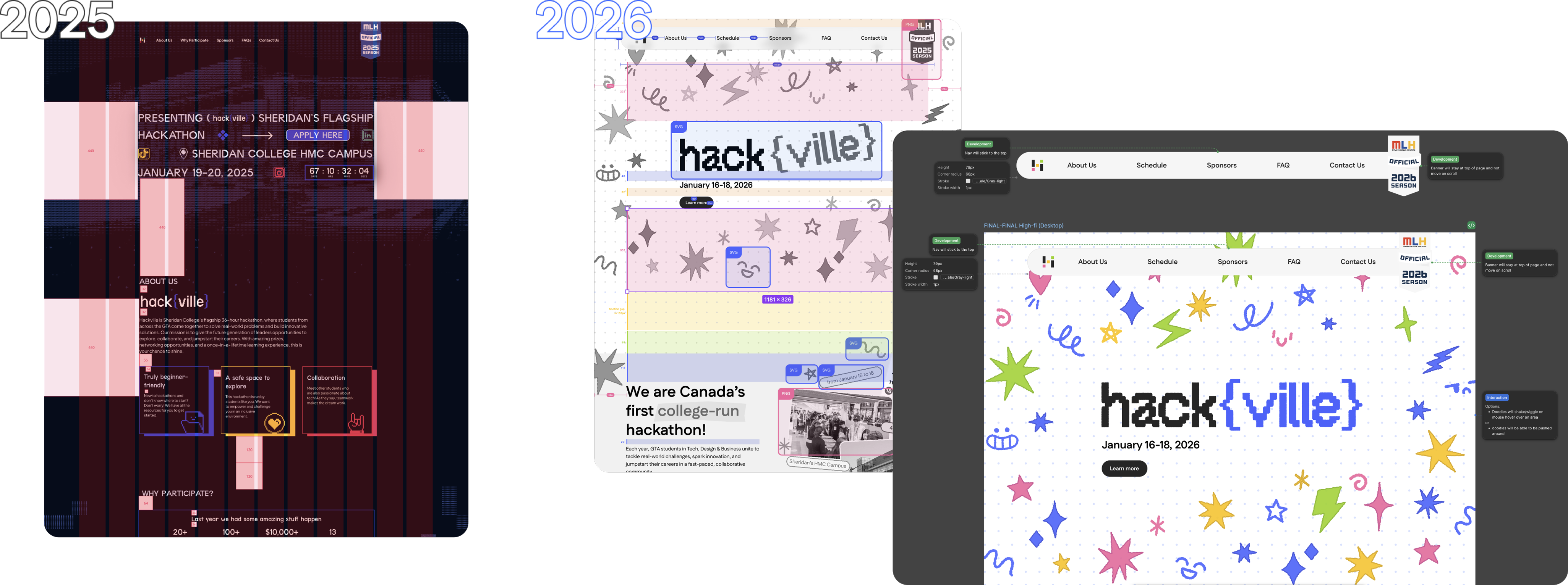
On October 31, 2025, the new Hackville website officially went live.
Within the first 24 hours, over 40 participants registered for email notifications, marking the most efficient registration rollout we’d ever had.
What does this mean?
For user - Participants now experience a smoother, faster, and more engaging journey from signing up to exploring event details. The interface feels intuitive, accessible, and visually consistent, helping users stay informed and excited about upcoming hackathon updates.
For Hackville - The new design system empowered our team to update content effortlessly, maintain brand consistency, and strengthen collaboration between designers and developers. For the first time, both teams worked seamlessly as one unified system, turning Hackville’s visual identity and technical foundation into a cohesive, scalable experience for future events.
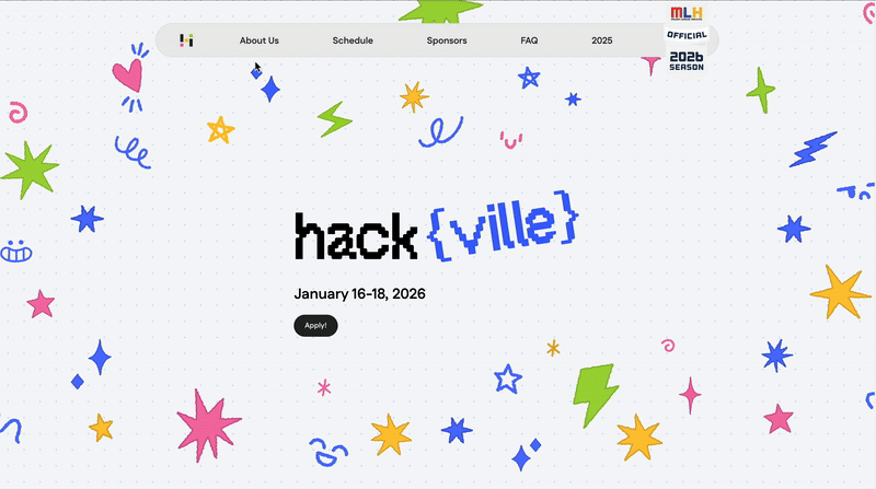
Interactive navigation and hero
A peek into Hackville 2026’s website
the design system as the backbone of everything
Beyond the website, the design system became the foundation for other Hackville products, from merchandise and posters to presentation slides for the 2026 season. It ensured every touchpoint stayed consistent, cohesive, and aligned with the Hackville’s visual identity.
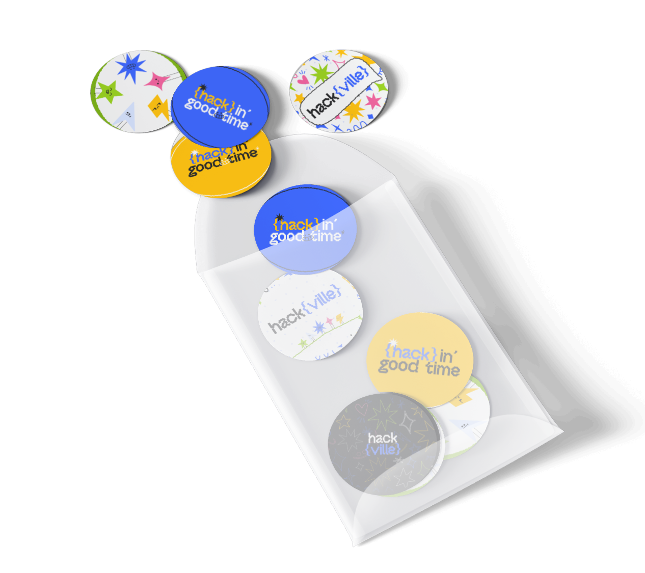
Pins by Sejeong
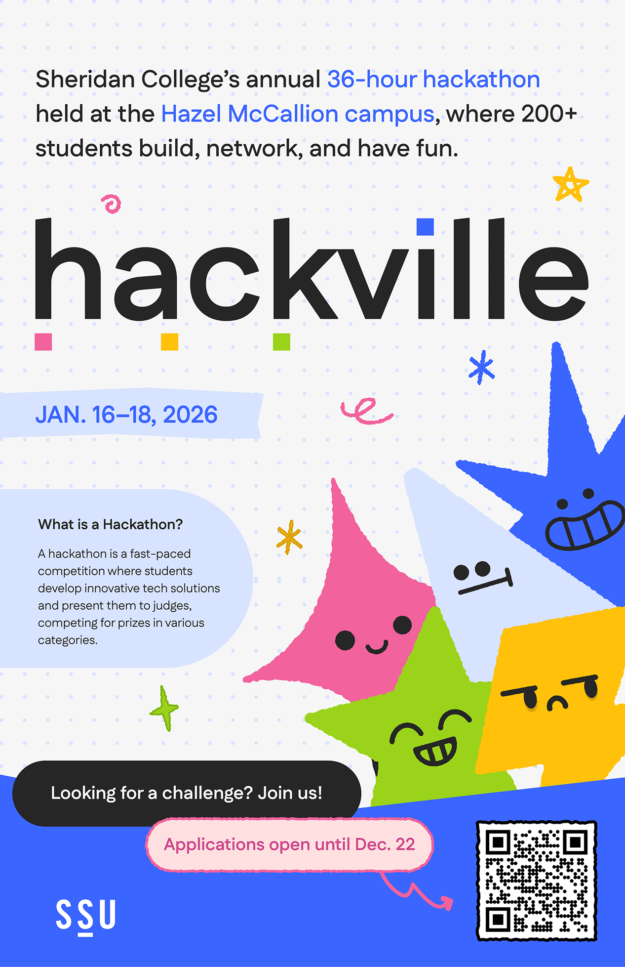
Promotion poster by Sabrina
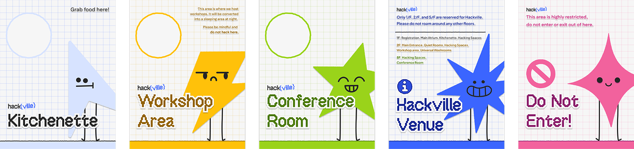
Way-finding posters by Chloe
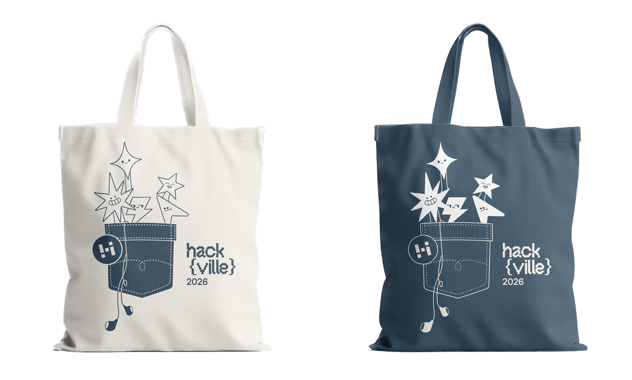
Tote bag by Celine
what did i learn?
Embracing the learning curve
This was my first time building a design system and preparing a product for developer handoff, and it pushed me further than any project before. I spent countless hours learning from Figma Library documentation, Google Design resources, and YouTube tutorials, breaking down complex workflows piece by piece. It was a painful but deeply rewarding process. Every moment of frustration taught me patience, perseverance, and the importance of humility when stepping into leadership.
Leading with clarity and empathy
This project transformed how I see design leadership. I learned that being a leader is not only about achieving results, but also caring for your team by having empathy, being clarity about our project goals that making sure everyone is on the same page, and trusting them. Taking on this role reminded me that growth doesn’t come from comfort, but from learning alongside your team, even when the path feels uncertain.
Communicating with confidence
I became more confident in communicating design rationale, managing timelines across multiple teams, and staying open to feedback even when it meant reworking my own ideas. These moments of collaboration strengthened both my confidence and adaptability as a designer.
Letting go to move forward
Most importantly, I learned that progress often begins by letting go of early concepts, assumptions, or comfort zones to make space for stronger and more thoughtful solutions.